Did you see the article in the Georgia Straight last week headlined “Modest Vancouver heritage home proposed to be reborn as boutique restaurant”? The accompanying picture showed a funky purple Victorian house with pink trim and the kind of cool architectural doodads, that we don’t see anymore.
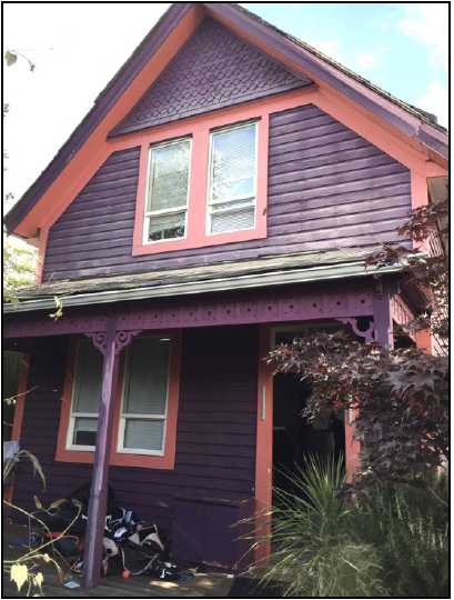
Sweet, I thought. Instead of pulling down another heritage house we’re going to repurpose it into a restaurant. And then I looked at the design rendering.
Yikes!
The funkiness has been stripped out along with the colour—it’s now white with a touch of grey—like a piece of public art. I guess someone thought a red door would be a good idea so restaurant patrons could find the entrance. The rest of the house is swallowed up by a six-storey, glassy non-descript building.
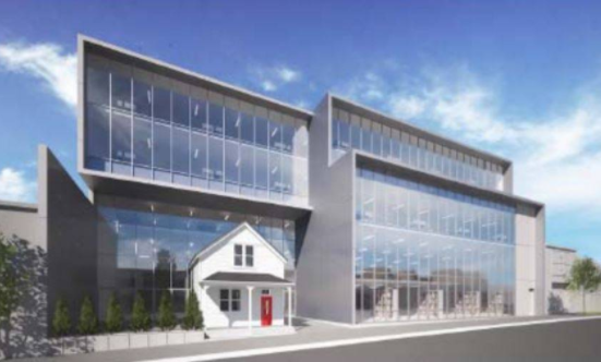
This is why people hate facadism.
The house has sat at 35 West 6th Avenue between Manitoba and Ontario Streets for going on 120 years.
The goal for the Vancouver Heritage Commission, says Michael Kluckner, was to try and retain some memory “however marginally,” of the working-class housing that once covered that area.
I sat on the Heritage Commission for North Vancouver District for four years and I understand the frustration of trying to save heritage and its many compromises. But in a case like this I think we have to ask—really?—what’s the point?
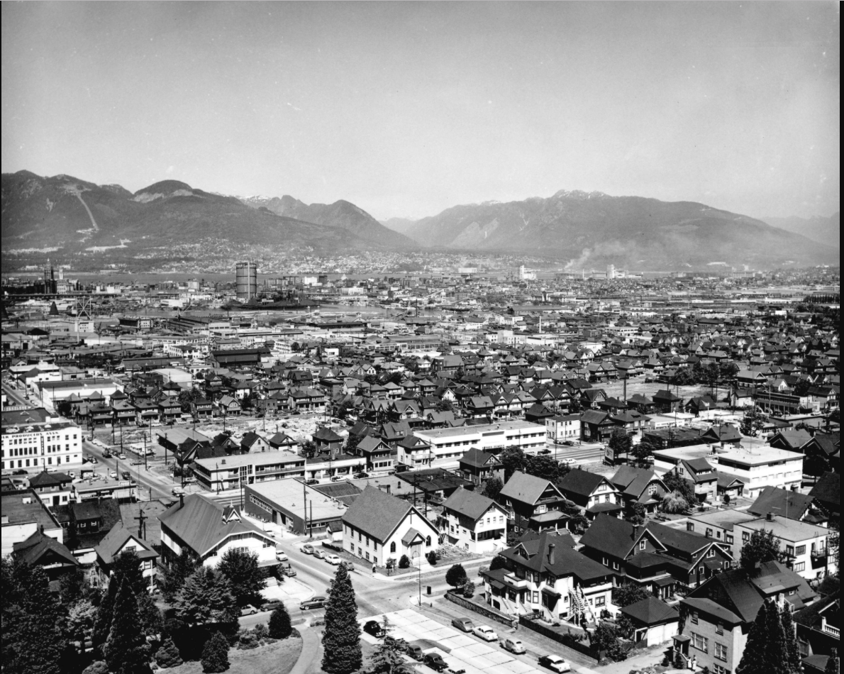
It seems a sad end for a house that gave sanctuary to a century of working class people. William Henry Coulter, who built the house was a millworker. Later owners include a tinsmith, an upholsterer and a shoe store clerk. In 1912, Sidney Boutall built and ran a neighbourhood grocery store in the front of the property and had the forethought to include sleeping quarters. The store lasted until 1978, and for much of its existence was known as the Sixth Avenue Grocery.
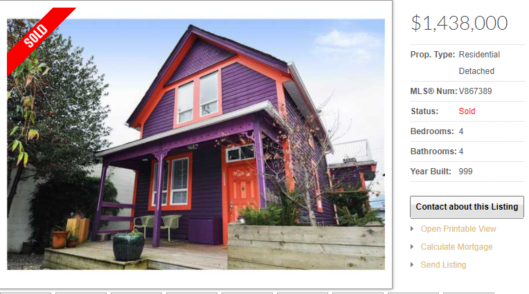
This working-class house had a paper makeover and was listed for $1.4 million in 2011.
According to the Statement of Significance the house is ‘important for its historic connection to Mount Pleasant’s early development, for its survival as a residence in what is now an industrial area, for its working-class occupancy history and for its design.”
Nope, not seeing any of that being salvaged in the new design—it’s taken away the context.
But I guess if people want to really know what Mount Pleasant looked like, restaurant customers can just look across the street. Amazingly, there are several of the original homes, still housing people that show what Mount Pleasant used to look like when the streetcar rattled along Main Street.
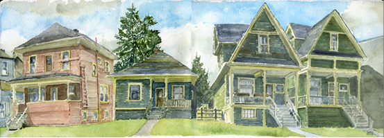
As Patrick Gunn at Heritage Vancouver says: “At times, the sum is greater than the parts.”
© All rights reserved. Unless otherwise indicated, all blog content copyright Eve Lazarus.


It is an abomination unto God and man! A thousand curses be upon it!
This merger is beyond dumb. It ruins two buildings. No points scored.
The before and after is so jarring. Seeing the front exterior tucked into the steel and glass, I ask: “Why bother?” Hate to say it. But a plaque with some photos and commemorative text in the lobby would have been better than this travesty.
Unbelievable.
It doesn’t show in the rendering but the house is essentially intact – the cantilevered portion of the new building extends over the back third of its roof – so it’s not a façadist project. And the view of the houses across the street? It’s there for now…
I find it interesting that it’s generally the younger members of the Heritage Commission who are the most supportive of this kind of thing. Whether it’s good or bad, I’m guessing it’s the future.
I actually love the concept, though I have seen better angles of the set up. The two buildings are such polar opposites – the crisp, cold, glass, modern larger building seems to almost wrap the older, warmer, wooden heritage home protectively. The ivy wall helps to make the space cozier. I am just happy they preserved the home, so similar to the one my mom and grandparents lived in. I look forward to visiting the area to take a look.