An Interview with Jazmin Welch, book designer about working on Vancouver Exposed
 I’m excited to tell you that Vancouver Exposed: Searching for the City’s Hidden History is now in bookstores. And, while the saying goes “don’t judge a book by its cover,” I have to disagree. A great cover not only helps to sell the book, but it shows the reader what they can expect to find inside its pages. I reckon Arsenal Pulp Press designer Jazmin Welch has nailed it with the cover of Vancouver Exposed, and for this week’s blog, I’ve asked Jaz to tell me how she came up with the idea.

What is your process when it comes to designing a cover?
Jazmin Welch: I always start by reading the manuscript or book proposal before diving into the design. From there, I will chat with the Arsenal team and the author about ideas and concepts before hitting the drawing board. Then I will sketch out many very rough ideas, decide which ones would make the most compelling visuals, and begin to digitize the concepts. Once the ideas are formed enough to present, I share them with the Arsenal team. It’s important to get editorial feedback as well as notes from marketing and publicity about the saleability of the concepts. From there, the favourites are revised and sent to the author for feedback.
What were the challenges with Vancouver Exposed?
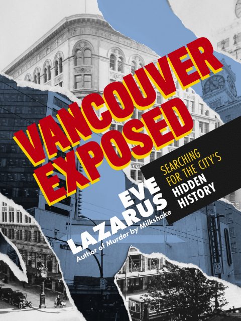
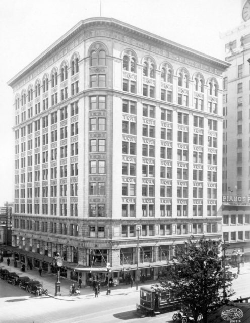
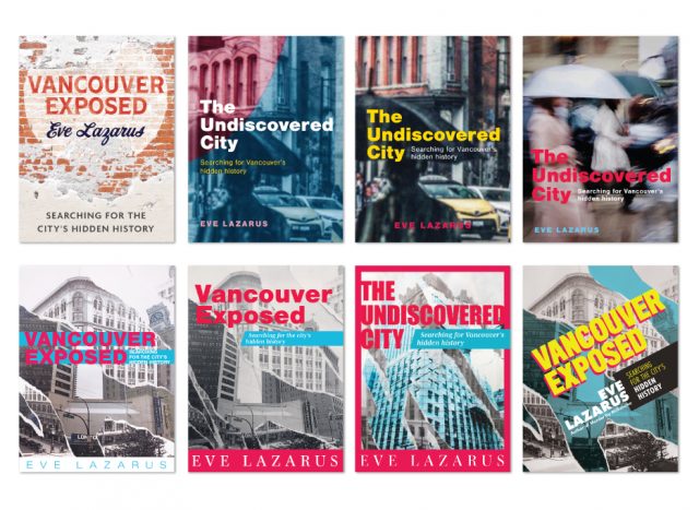
Jazmin Welch: With a book like Vancouver Exposed, if you choose one image it has to be representative of the whole book. Although the cover ended up depicting just one story within the book, the concept of uncovering hidden history applies to all of the stories. The Birks Building is a classic example of a beautiful building that was demolished, only to be eventually replaced by a boring, ugly, concrete structure. The fact that there was a funeral for the building before it was torn down, demonstrates the connection that people felt to the building, its beauty and its history.
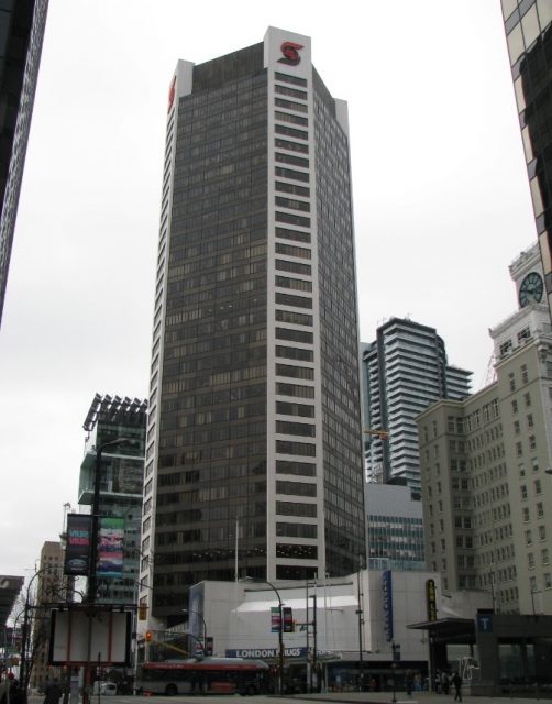
The cover is a great mix of archival photos from the 1920s and the site’s current evolution. The torn effect really gives me a feeling of destruction and the importance of remembering our missing history:
Jazmin Welch: It marks the way in which some societies do not protect their heritage and begs the reader to notice it and confront the history that was lost. Due to Vancouver’s notoriously grey skies it was hard to get a clear photo of the site where the Birk’s building used to be. It was also nearly impossible to get the shot from the same angle as the original image of the Birk’s building, but we ended up being happy with the two different vantage points.
How did you choose the type?
Jazmin Welch: Some of the stories are quite shocking and eye-opening and I really wanted the type to convey a sense of newsworthiness. The heading typography was chosen to mimic “BREAKING NEWS” headlines in newspapers and the body font was also inspired by readable fonts that were created in the 90’s for newspaper use to fit comfortably in narrow columns and read well in small sizes. But because this is a 2020 book, I didn’t want it to seem outdated, so I used a mix of the wide font and a more narrow font within the headlines to create a contemporary, unique look.
What were some of the earlier attempts – and why did you reject them?
One concept showed a decades-old ghost sign that had been covered over by new buildings, but the image wasn’t hitting a chord because it wasn’t indicative of the whole concept of the book and was a bit too specific of an example of “hidden history.” Other examples were shots by Vancouver street photographers, but although the covers were compelling and conveyed a strong feeling about the city, they were a bit too abstract for this kind of historical non-fiction book. We had to find a balance between abstract and specific.
Pick up your copy of Vancouver Exposed at indie bookstores or order a signed copy through Arsenal Pulp Press.
© All rights reserved. Unless otherwise indicated, content copyright Eve Lazarus.